Paper 1- The Dumbest Generation: semantic analysis of Website
What is “the dumbest generation”? Who could be “the dumbed-down popular culture of young people”? Why “The technology that was supposed to make young adults more astute, diversify their tastes, and improve their minds had the opposite effect” ?
If those who are belong to “the dumbest generation” visit the website “The Dumbest Generation” by Mark Bauerlein, they might possibly be get angry or confused because of such thought-provoking phrases in the home.
Visually speaking, we can see the website framed by certain clear and simple layouts. Both simple style and colour of the texts are acceptable for visitors to go thourgh quick ly. As one see the text-codes in the “home“‘s html, one might the colours are all white as following.
var col_primary=”#ffffff”;
var col_secondary=”#ffffff”;
var col_tertiary=”#ffffff”;
var col_background=”#ffffff”;
The thoroughness in white colors also will impress readers as a relatively readable website. Red letters of the book title at the top of every Webpages , “The Dumbest Generation”, might be recognized as a somewhat sensationally eye-catching headline, like this: “The Dumbest Generation” . Excepting the tilte’s letters, whiteness of the background and thinnish black font styles of the texts in the Website force viewers not so successfully into lust for purchasing the book. If the purpose of the website is selling the book in practical, the site might be more appealing and more marketing-strategic like the Amazon.com. or other online bookstores.
The point is not how to sell the book, or how to show the Web publish-marketing strategies. Indeed, one of purpose of the Website might be an advertisement of the author’s book. But if we consider the words on the site, avoiding the click button “buy”, the words as well as contents of the book are more radically meaningful.
Then what the site want to tell us through the Website?
Is the purpose of clearness and whiteness on the website supposed to be consideration for “the dumbest generaion” to be easy to read without any high-technic read-skills because the generation is the dumbest? Do images in the site, such as robot-like figures or several clipped collages of any online-game’s pages, stand for “the dumbest generation”? And does the author have intention to make fool of the generation?
As a non-native English speaker, the website has not clearly shown meaning possibly, or rather, the words are only graphical patterns. Such a personal background as for linguistical difference might cause a gap of understanding between native English speakers and non-native. If one try to explain such a distance in semantic terms, it is mentioned in the explantion of “Connotation”.
The socio-cultural and personal associations produced as a reader deocodes a text. For Barthes, connotation was a second `order of signification´ which uses the denotative sign (signifier and signified) as its signifier and attaches to it an additional signified. In this frame work, connotation is sign which derives from the signfier of a denotative sign. (Daniel Chandler, “Semiotics“, 2007, p.246.)
If a phrase “50 Million Minds Diverted, Distracted, Devoured”, is taken as an example, it might be impossible for me to understand it accurately in an instant. Only I think how surprising numbers of minds are diverted, distracted, and devoured, if the phenomenon is truely happening.
Meanwhile I read it metaphrastically, native English-speakers or other readers who are familier with English language might undertstand it more metaphorically.
Possibly they think “million minds” is not really equal to million minds. Each readers will perhaps interprete the words individually or idiolectically. But the it is remaked that differences in interpreting texts are existing in discourse, which “are socially constructed knowldges of (some aspect of) reality”. (Gunther Krees & Theo Van Leeuwen, “Multimodal Discourse“, 2001, p.4.)
Taking titles of each reviews of the book as another example, the metophorial point would be more clear.
The New Atlantis, ” Is Stupid Making Us Google?” by James Bowman
Los Angels Times, “How dumb are we? Thanks to the Internet, dumb and dumber, this author writes.” By Lee Drutman
The New York Times, “Growing up for Dummies” by Charles McGrath
The Wall Street Journal, “Can U Read Kant?” By David Robinson
News Week, ” The Dumbest Generation? Don’t Be Dumb.” By Sharon Begley and Jeneen Interlandi
As we see, the reviewers stands for the books in the unique words respectively. Some are more provocative, some are more humourous.
As we face such a difference in linguistical or cultural context, it is necessary for us to find a sign in order to give a certain meaning to the texts. At the point, the question what the site tells us will be converted into HOW to read the website using any signs as a clue .
A sign is a meaningful unit which is interpreted as `standing for´ something other than itself. Signs are found in the physical form of words, images, sounds, acts or objects (this physical form is sometimes known as the sign vehicle). (Daniel Chandler, “Semantics”, 2007, p.260.)
If signs are including “the physical form of words”, the font of the above reviews’ titles also shows us a interesting signs.
The most provocative title might be “Can U Read Kant?” By David Robinson in The Wall Street Journal. In addition, this use a specific font that is a bold, Gothic and realtively larger size, which might attract visitors’ eyes. If the title’s font as well as informal orthography means that “Metaphors need not be verbal.”, what metaphor the reviewer would show us? In this phrase “Can U Read Kant?”, how should we find semiotic distinction between meaning and words? Chandler explains that “Semiotics has an important synthesizing function, seeking to study meaning-making and represenation in cultural artifacts.” (Chandler, “Semantics”, 2007, p. 223)
Although the contents themself of the book are somewhat provocative for some readers as well as some reviewers, the Website itself has no offensive advertisment on the contrary. As mentioned at first, we can read easily thanks to the simple layout and the white background. As a result we could find a sample of an ideal Website that use the less signs and texts in order to shorten distance between receiver and sender. Such a simple design and uninformecial texts shows accessible to the public paradoxically.
Reference:
Chandler, Daniel (2007) Semiotics : the basics, second edition, London : Routledge.
Cranny-Francis, Anne (2005) Multimedia : texts and contexts , London : Sage.
Kress, Gunther and van Leeuwen, Theo (2001) Multimodal discourse : the modes and media of contemporary communication, London: Arnold.
House, Juliane (Editor) and Rehbein, Jochen (Editor) (2004) Multilingual Communication, Amsterdam/ Philadelphia, John Benjamins Publishing Company.
Radan Martinec and Theo Van Leeuwen (2009) The language of new media design : theory and practice, London : Routledge.
(1089 Words)
about Guide to UiB 2
Here is my assignement of guide to uib 2.
Guide to UiB1 is here.
In my information architecture, the categories are:
1. entrance
2. student centre
3. meet and eat
4. place to study
The reason why I have chosen these above categories is because I personally love simpleness and briefness. Not only because of my technical problems and poor skills in html and css, but because of taking readability and usability (Jacob Nielsen’s Alert Box) into consideration, I thought these 4 categories might be understandable for anyone who see the Webpage.
For example, if a stranger comes to UiB in real, the person might want to know where is the entrance. The pictures of entrance are really useful to grasp the first impression, when the strange person seek any web page about UiB in advance. Surely, maps of the campus should be rather useful in practical, but if the person cannot read English and Norwegian, or has trouble with reading literal texts and map figure, images might be effective in such a case.
The pictures of the Student Centre are also informative for visitors who want to know about facilities for daily use. In my experience, when I came to UiB at first and looked for the Student Centre, somehow I didn’t notice the building, though I was standing just in front of it. Because of the modern and futuristic appearnce, I had thought the building might be a science laboratory until I realized it.
As well as the Student Center, 3rd category, “meet and eat”, should be a necessary part of life. Socialization and nutrition might be hard
for visitors to find in an unkown place. The pictures of Cafeteria at UiB give visitors good advice about how students at UiB enjoy their lives.
4th category, “place to study”, has also the potential to be used for finding the students’ life. For most of prospective students at UiB might worry about what and how to study at the campus, the pictures might make them positively encouraging.
However, comparing with the official site of UiB and other classmates in HUIN105, there are less texts, images, and links in my guide to uib 2. Probably, if one make an ideal guidebook website, it shoud contain more practical information and classify them into several purposes of visiting, like Lonely Planet, JTB or World Travel Guide.
Guide to UiB 1
Welcome to Guide to UiB!
The University of Bergen is located in the center of Bergen, Norway.
When you enter the campus, you will find a lot of f fascinating architectures telling their history.
Among others, this historical church, Johanneskirken should not been missed out at the first time visit to UiB!

Church
Next to the spectacle church, your eyes will be caught by this wonderful Museum Garden.

garden
And then, take a walk inside the garden for a couple of minuites, you can appreciate some interesting plants and fresh air. But you had better not throw up any garbages or dirty things therein, otherwise, they will disturb the nice spectacle as well as your foot and dignity someday.
The Museums are also really fantastic places to visit once in your life!
It is strongly recommended to drop in when you are tired of your life. You will find an answer to all your problems! If not, visiting the above-mentioned church might be alternatively helpful.

The Cultural History Collections

The Natural History Collections
Tutorial 2
Today’s tutorial discussion:
What do you think about the Jakob Nielsen’s Alertbox for October 1, 1997?
How Users Read on the Web
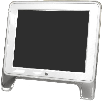
Probably I agree with the Mr. Nielsen’s suggestion about the usability improvement in “Reading on the Web”, only if nowadays the usablitiy of reading on the web has been not improved yet. Conservatively thinking about the topic, I suppose what the most problematic for general users to read electronic texts is to make them feel as if they were reading unsubstantial and unsteady graphical letters on the Liquid crystal display, so called LCD.
 (Image from http://upload.wikimedia.org/wikipedia/commons/d/d0/Powermac_g4_lcd.png)
For example, when I have taken both TOEFL Paper based tests and Computer based tests several times in the past, I felt they required me of different skills respectively even if the contents of the tests were similarily structured. When I took CBT, which literally means that you take with computer at the test center, I felt as if I were scanning texts on the screen as Nielsen states on the top of his above-mentioned site. The feeling didn’t occured to me when I took PBT, which literally you must fill out your answers into paper sheets with your decent pencil and eraser. Though it might be practically impossible to explain why I had such an experince, if my experience in such this reading test on the LCD screen is allowable to take an example of readablity, I would say that readbility on the web must demand readers higher sklills in reading texts than read traditionally published texts. Now TOEFL has changed both these styles that I have taken ever into a new style, internet based test, namely iBT. When I took it recently, about two month ago, I felt more unresolutional difficulties with it. Even though this was absolutely because of my poor language ability, the texts on the screen should be more slippery or elusive. Because of some undifined eidetic tricks, sometimes my eyes are confused by the visual chaos on the display (I also don’t understand what I wrote here). It was not until today’s tutorial that I noticed that those who have mentally or psychological difficulties with reading texts could be considered in the contexts of the Web technology. Nielsen’s research should be more expandably taken into consideration nowadays in a more alternative perspective.
mini repo
discussion of the artists’s defense of the work
-Would you be offended if your brother or sister or lover had died in Iraq and their face was one of the tiles in the mosaic?
I personally might say yes. In terms of privacy rights, it is impossible to ask a dead person if his/her face picture might be used in this mosaic.
-Do you agree with the artist that this image “is not a textual statement or rhetorical argument”? Does the image express anything? If so, what?
I agree, if the notion of textual or rhetorical means verbal, literal or wordy, or something like that. Absolutely it does not use any English scripts or words. Semantically rethinking, it might be difficult to agree with it without any question. The image should provoke viewers to pop up any texts associatively in their minds.
-The image spread across the world, being republished in blogs and newspapers and shown on television. Why is the image so appealing?
The image doesn’t demand viewers to take time to undertand what is going on, even if they are not able to read literal things. Otherwise, some images are probably spead by certain unfavorable or illegal digital technology. But seriously thinking, the image can give viewers possibilities to READ the world more multidimenstionally than texts.
First tutorial
First tutorial
In the first tutorial, our group discussed the topic of goarmy.com .
- Why did the company or organisation make this website?
As a campaign blog, the website is focused on the recruitment of U.S. Army Soldier.
- Who do you think they imagine will view it? Who is the target audience (målgruppen)?
- How have they tried to reach or attract this target audience? Think about the use of language (a particular style?), the images and visual design, the tone of voice.
The ultimate purpose is to be decleared that they want younger adults as a solidier in order to achieve the strengthening of military power of U.S. Army. If we take an comarative example of other contry’s. For example, Japan, which has also a similar military system, the Japan Self-Defense Forces, so-called Ji-ei-tai, the differences between them will be clear, when you compare those sites. Meanwhile both sites have settled the information for applicants, the JSDF (only in Japanese) might be less aggressively than U.S.
- Do you think it works well? Why/why not?
As an informative advisement of the military service in U.S., the site might be successful in showing what staffs in the U.S. Army are like. In the middle of the first page, they use effective moving pictures, like a slideshow, which might make viewers somewhat exciting and feeling virtual games. Imaginably the site expects that people can get any positive imagery about the U.S. Army. By repeating same flash images that have, it might cause a kind of subliminal effects to viewers so as to impress positive images in their memories. Meanwhile, in this site, we cannot find any actual matters in miliary services, which are popped up quickly in the public eye by the web-based visual tools, such as online news. If one reads such an article, the Internet should be informatively functional. On the other hand, it might demand viewers of a multi-dimensionally thought-provoking media literacy.
Assignment 1-3
What trackback is…
When I edit my blog in wordpress.com, I find the box of trackback just below the words that i write. Though somehow I tried to copy and paste the box just as I see it, it was impossible for some reason. But generally any blogger in the WordPress.com will see like this following.
Send trackbacks to:
(Separate multiple URLs with spaces)
Trackbacks are a way to notify legacy blog systems that you’ve linked to them. If you link other WordPress blogs they’ll be notified automatically using pingbacks, no other action necessary.
Honestly I use the blog-editting in Japanese version because of my poor linguistical ability, but I would understand the explanation likewise the above English version. If you fill out the URL in the box trackbacks, it can be noticed to anyone who you linked in your blog. Clicking the explanation, you will see more detail information as following;
There are three significant differences between pingbacks and trackbacks, though.
- Pingbacks and trackbacks use drastically different communication technologies (XML-RPC and HTTP POST, respectively).
- Pingbacks support auto-discovery where the software automatically finds out the links in a post, and automatically tries to pingback those URLs, while trackbacks must be done manually by entering the trackback URL that the trackback should be sent to.
- Pingbacks do not send any content.
Comparing the differences between the trackback and the pingbacks, it will be more easily to understand the concept of the trackback. This system should be necessarily functioned in order to protect writers’ copyright in the blogger world.
Assignment 1-2
Q: Why did I choose to take HUIN105?
A: In HUIN105 it might be more exciting for me to try something creative. Last semester I had no positive results only to fail showing what I did during studying at the UiB, which caused me an identical crisis crtitically. The tasks in this course should demand me of higher computer skills than I have actually, but I thought it should be well worth trying once in order to achieve knowledge about web design and information technology aesthetics for my future career as a creative designer.
I remember the name of the first programmer, Ada Lovelace, when the name was mentioned in the lecture. As long as my memory is correct, I found her name in a Japanese SF magazine, in which featured a SF movie that Tilda Swinton plays as A. Lovelace. At that time, probably I was 20 or 21 yrs old, I was only interested in female SF writers who might focus on a somewhat feminism perspective. I didn’t actually undetstand what A. Lovelace technologically invented for the comuputers. Instead I only considered whether she could have spent her fleeting life happily or what people can do during the short life-time or something like that.
Assignments 1-1
Q: Have you blogged before? Do you read blogs? Do you like the idea of blogging?
A: Yes, I have blogged before as a personal journal, which is awefully unreadable because of the unintelligent texts. Sometimes I’m reading blogs of my friend Arrow, who is a really awesome creator in the world. Or the blogs I often read are mostly made by those who are not my friend in person but totally stranger, some of whom might be publicly famous or well-known for some honorable achievement (or not). In general, search engines that I use everyday are mostly Google or Yahoo! in order to search only general information. It is not until recently that I notice what kind of search engines are mainly used in Norway, or other European countries, for example, Finn.no, Nettsøk-Kvarsir or Technorati. As I have used the Internet with my PC at my room or at the campus, these search engines are really useful to collect not only general information but also local information, such as local maps, events or shopping sales.
Getting back to bloggings, I pick up some blogs has specific themes or contents by these above-mentioned search engines. For example, I am personally interested in books and indie pop music, such as my favorite juvenile books’ author Noriko Ogiwara or indie pop magazine, NOIZE MAKES ENEMIES.
Probably the idea of blogging is the best way to express what you think for many people all over the world, which relatively might not require everyone difficult computer skills. Thanks to highly improved degital media technology, everyone can deliver their more directly and more spreadingly. This style should be irrevocably counted as a highly potential writing activity without any professional publishing agency.
Q: What do you think of Facebook group set up for HUIN 105? How should universitites use Facebok? Should it be a part of a business or or an organisastion’s web strategy?
BEFORE using it
Honestly speaking, I am not sure exactly how Facebook could function as a social networking service, because I have not so often and deeply use that . But it might be a way to find someone who has similar interests that you have also, whereever you live. If we use this expandably social formativeness to advantage in universities, it should be essentially useful for researchers to communicate easily in a short time so as to interchange their own researches or to share good ideas each other.
If we make use of any networking service as a web strategy, though in my assumption, Facebook might have a lot of problems in terms of personal privacy. Now most of people find it difficult to protect personal informtation on the Internet. If we find any solution regarding to secutiry of personal privacy, Facebook will be a potential business for those who need social communications.
AFTER
As I used Facebook as a GOOD-MANNER user, I found it more difficult for most Japanese academic institutions to use Facebook as a social network than U.S. or other countries. The reasons are following. 1) I could not find my alumni at all! This might be not only because of my friendlessness but also fewer registered Japanese academic institutions than other countries, 2) International students are mainly targeted as a major user, 3) Less familiar to Japanese students than other Social networking service, such as Mixi. This is not precisely the same SNS as Facebook in terms of the registration system, which requires would-be members to be invited from any friend who has already been registered as a member. But according to the company’s press (in Japanese), the system of new sign-up will change into optional way in 2009.No one knows what will happen after the change, which might make this SNS more openly socialable and frankly communicative like Facebook or Myspace. But it can be imagined that anonymity in the SNS might be more saturated in future because of the unlimitedness of user entry. In terms of informatic technology business, SNS should be partly successful in communicating with others all over the world. Partly unsuccesful things are found in this SNS because of the relatively losen privacy policy. I personally worry about the possibility that these personal pictures in any groupes might be used for some unfavorable purposes which are beyond the general user’s imagination.

leave a comment